Aha! You thought this column (I know I’m supposed to call it a “blog,” but I’m old-fashioned) was going to be about the lack of artistry among critics, or perhaps their inability to appreciate artistry in writing, didn’t you?
Nope. “The” critic in question is just me. And the column has to do with the brightly-coloured header image above.
You see, when Jean Weber created this site on my behalf she selected a beautiful “placeholder” image of red Japanese paper lanterns amid tree branches.
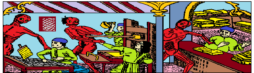
I quickly replaced this with a rather fussy and busy medieval woodcut in B&W. It didn’t really stand in contrast with the background tile image so much as merge with it and create an overall impression of visual confusion.
So I promptly took the image file to Microsoft paint and began colourizing it. In order to use the “bucket-fill” feature I had to isolate certain areas by extending boundary lines pixel by pixel to make the space within self-contained. At the same time I took the opportunity to erase certain features in the image to render it simpler and easier to grasp visually. Most painful of all, at 800% magnification I tracked down each and every stray pixel and deleted it, which took me hours as there were so many of them.
My eyes becoming tired, I then took a nap. You know how, with your eyes closed, you see an ever-shifting, swirling cloud of extremely faint points of light? I found myself gritting my teeth and frowning as I subconsciously attempted to focus on each individual dot of light and delete it. Couldn’t focus. Couldn’t delete. It was very frustrating. Awfully hard to fall asleep when your eyes are so darn busy. Made my head hurt.
Anyway, when I got back to the image all I had to do was fill in the colours, which is sort of like using a colouring book with an automatic “stay-within-the-line” function. I think the result looks pretty good. The red Death Demons, the lime green of the printer’s clothes, and the bright yellow of the books and papers really stand out against the background. The whole image practically pops off the page. It is now vividly separated from the background tile image. A very strong contrast indeed!
Of course, some may question my use of lavender for the ceiling panels and pink for the carpeting, but as I wanted to get the image done as quickly as possible I limited myself to the select colours provided and made no attempt to “create” my own colours with the hue control. I think this was a wise decision. As coloured the image is very successful I think. I like it.
Any artistry remaining after “the treatment” is of course the product of the original artist’s skill. Nothing to do with me. Art has nothing to do with me. Lively stick figures are the best I can do. This is why I am insanely pleased with the result of my “colouring book” exercise.
As for the background tile image, it is probably my favourite woodcut from the late medieval or early renaissance period. Shows a monk, or possibly an Abbot, or maybe just a rich retired merchant, reading a book. He seems like a comfy slippers, comfy sweater, comfy chair, comfy book kind-of-guy. Sort of a precursor to Perry Como or Andy Williams, or me. I identify with what he is doing.
The alarmingly heavy-looking over-sized book is probably the Bible (which in this period the lay public was forbidden to read) but judging from the faint smirk on his face it could well be the partially-preserved manuscript of “The Satyricon” by the famously jaded Petronius who was a literary advisor to his patron the equally jaded Roman Emperor Nero. At any rate he seems absorbed in what he is reading. I love reading. It is my favourite way to relax. I’m a very lazy fellow, so I get a lot of reading done.
Being profoundly lazy is the easiest way to be a productive critic, I say.